Camon Camon
Scope: Brand direction, stationery suites, packaging, website concept
Platforms: Illustrator, Photoshop, Squarespace with custom CSS/HTML
Key skills shown: Typography, print layout, art direction, product packaging and presentation, website layout
Self-initiated brand concept for Camon Camon, a wedding stationery studio inspired by the Vietnamese phrase for “thank you.” The project brings together semi-custom stationery suites, matching wedding website templates, and custom design options into a single, cohesive brand experience.
BRAND FEEL
Expressive • Non-traditional • Genuine
DESIGN DIRECTION
Refined Typography • Contrast • Playful Details


The Idea
Camon Camon is built around gratitude, memory and personal expression. Rather than treating stationery as a formality, the brand positions invitations, details cards and keepsakes as meaningful pieces people send, hold onto and return to later.
The Execution
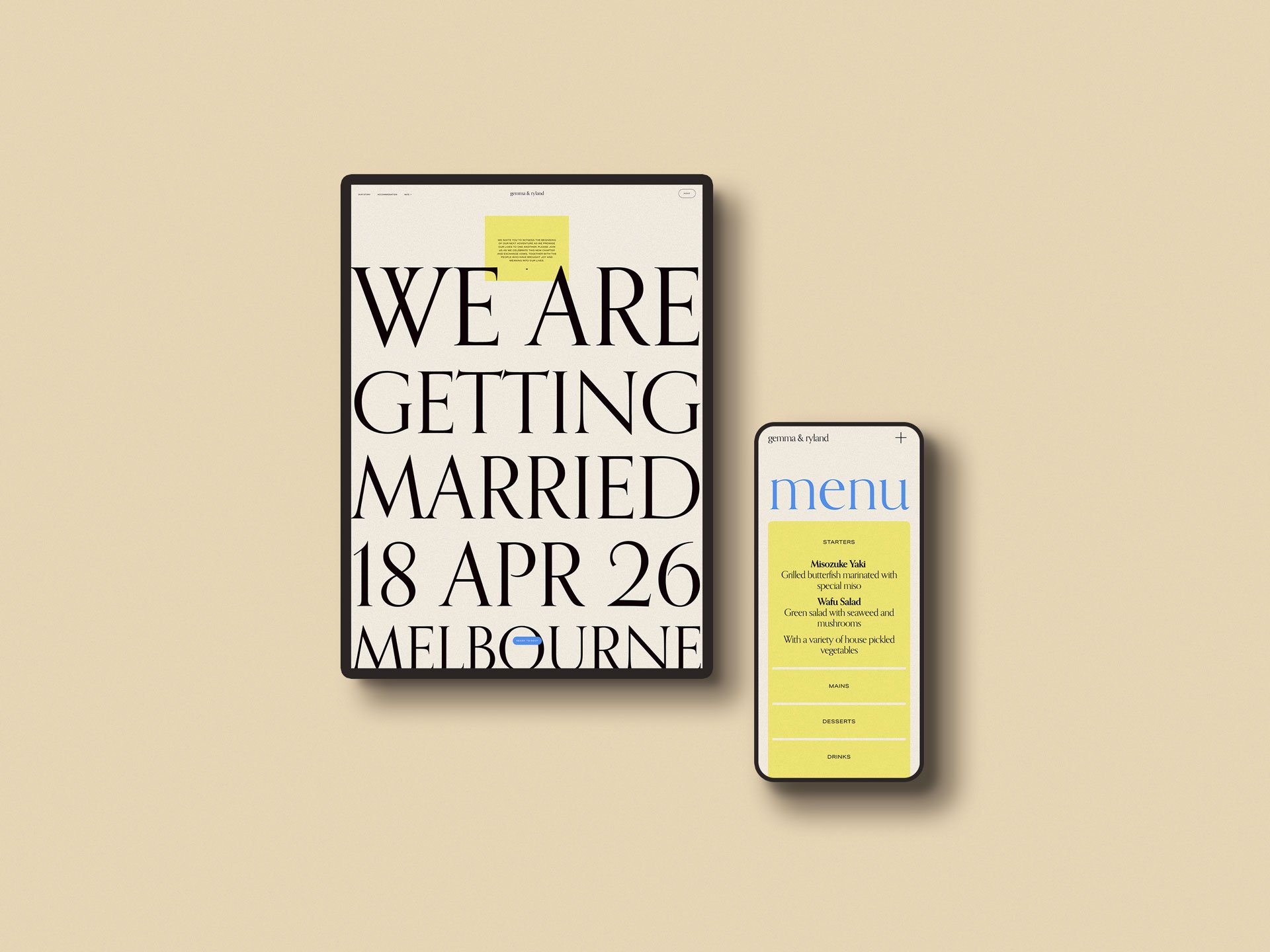
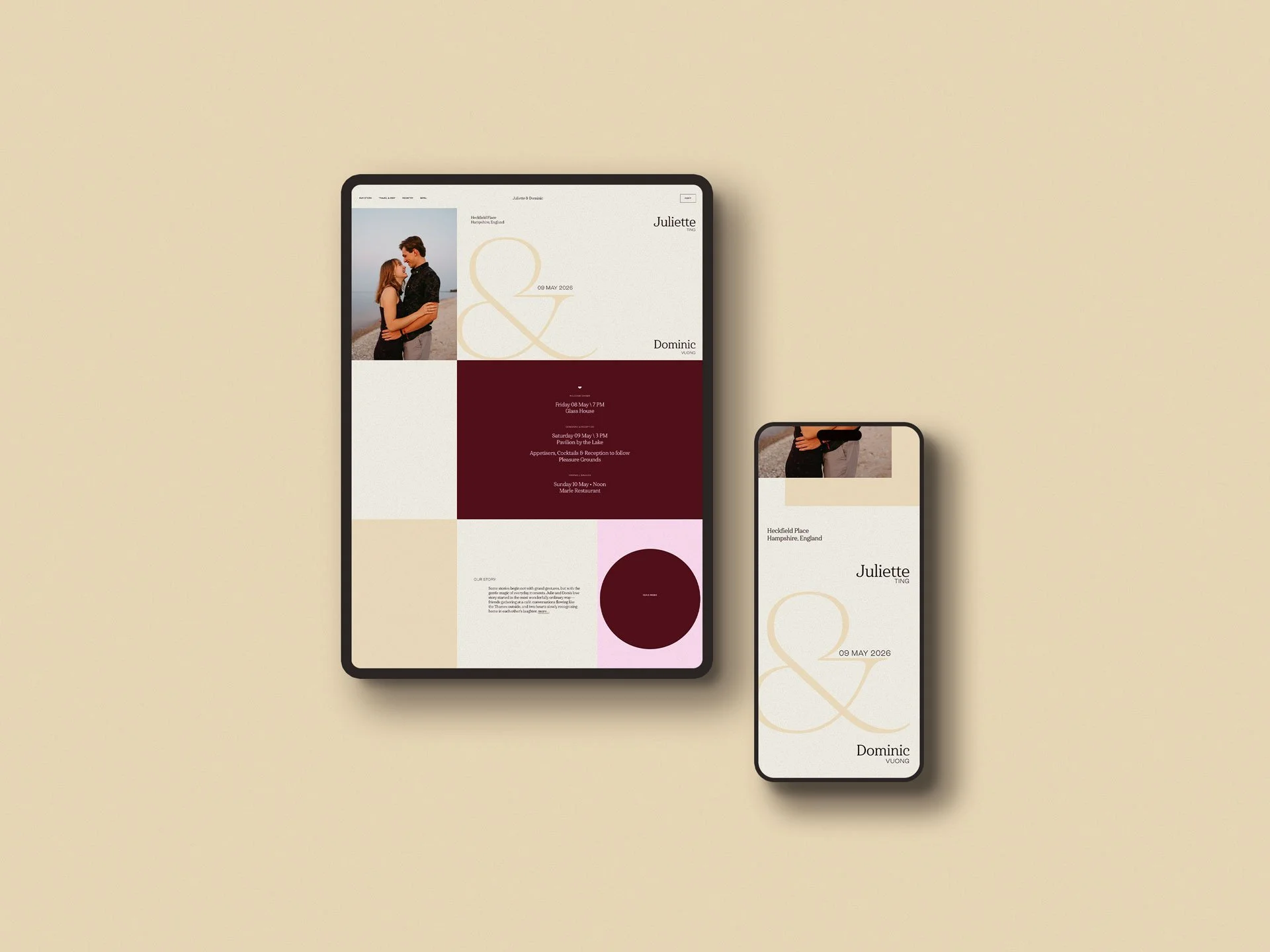
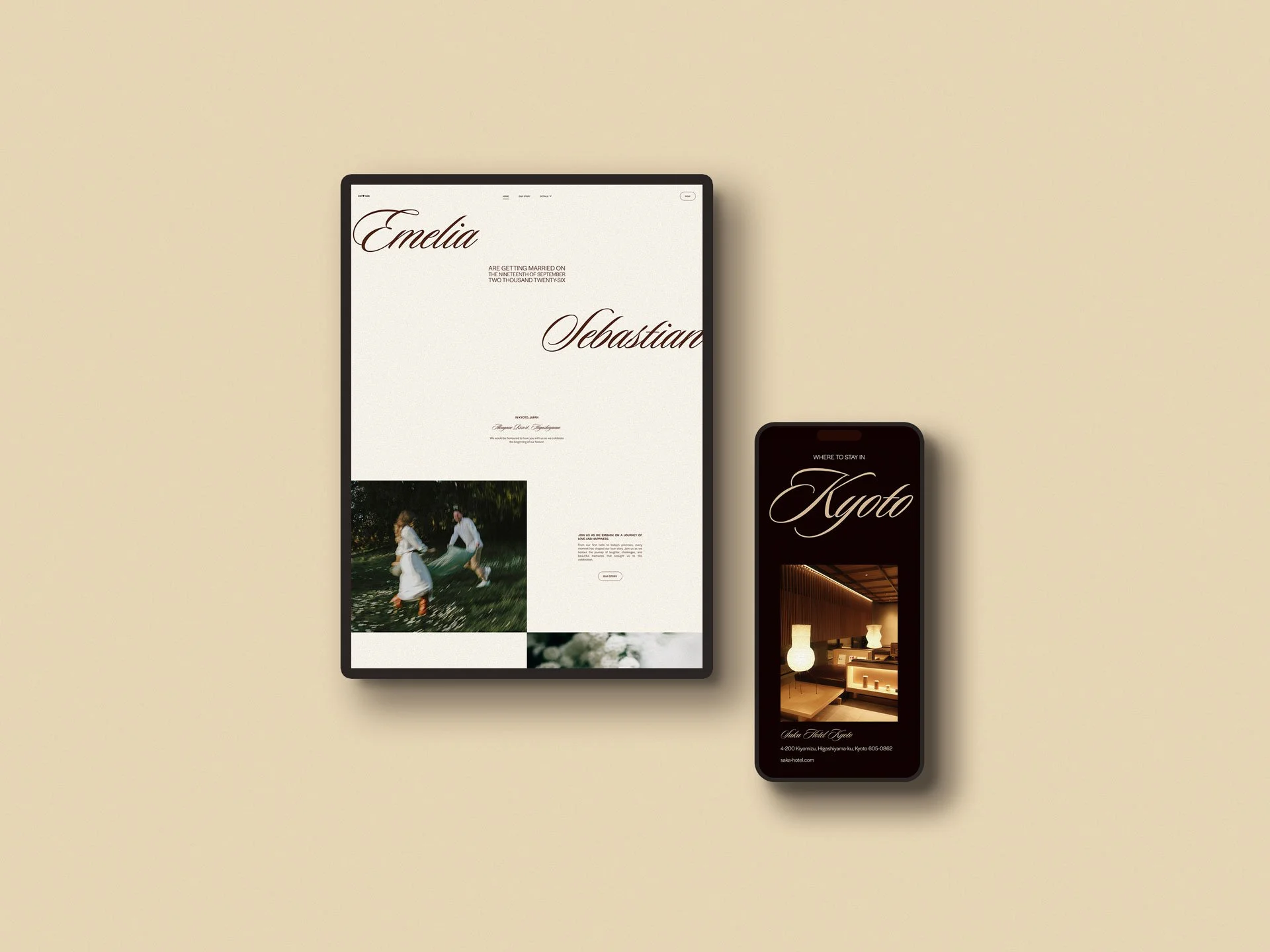
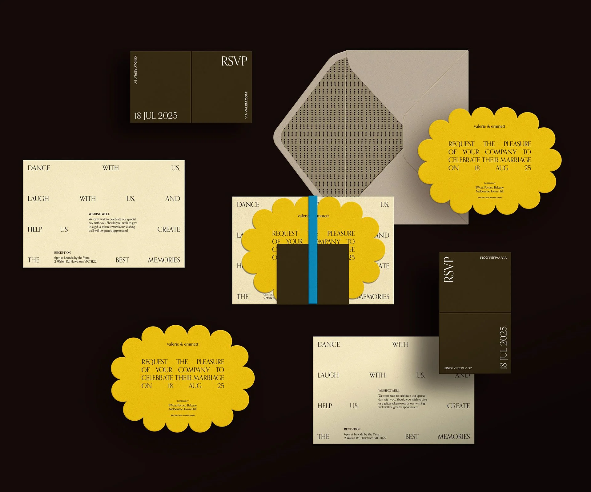
The project was designed as a flexible stationery system that could support semi-custom products, custom design work and matching wedding website templates. The visual direction uses expressive typography, rich colour, playful suite names and tactile print-inspired layouts to create a wedding brand that feels warm, distinctive and less expected.
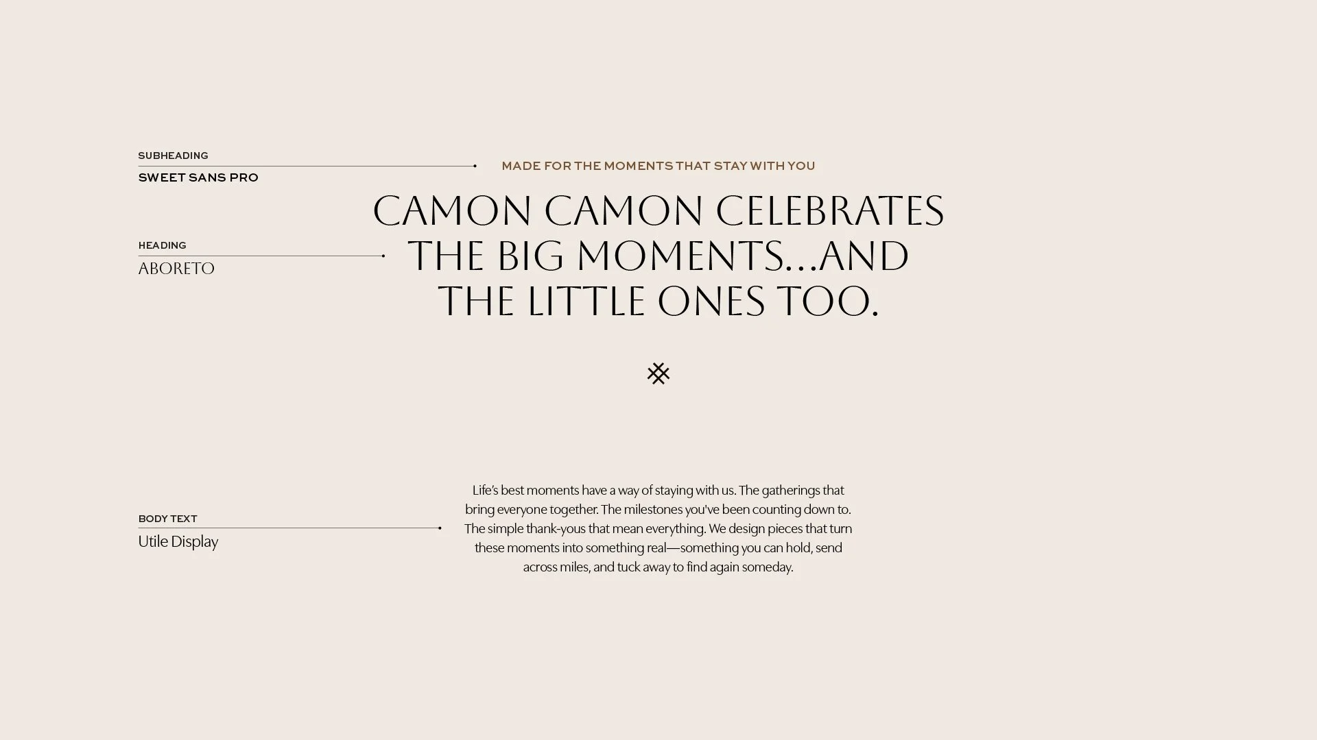
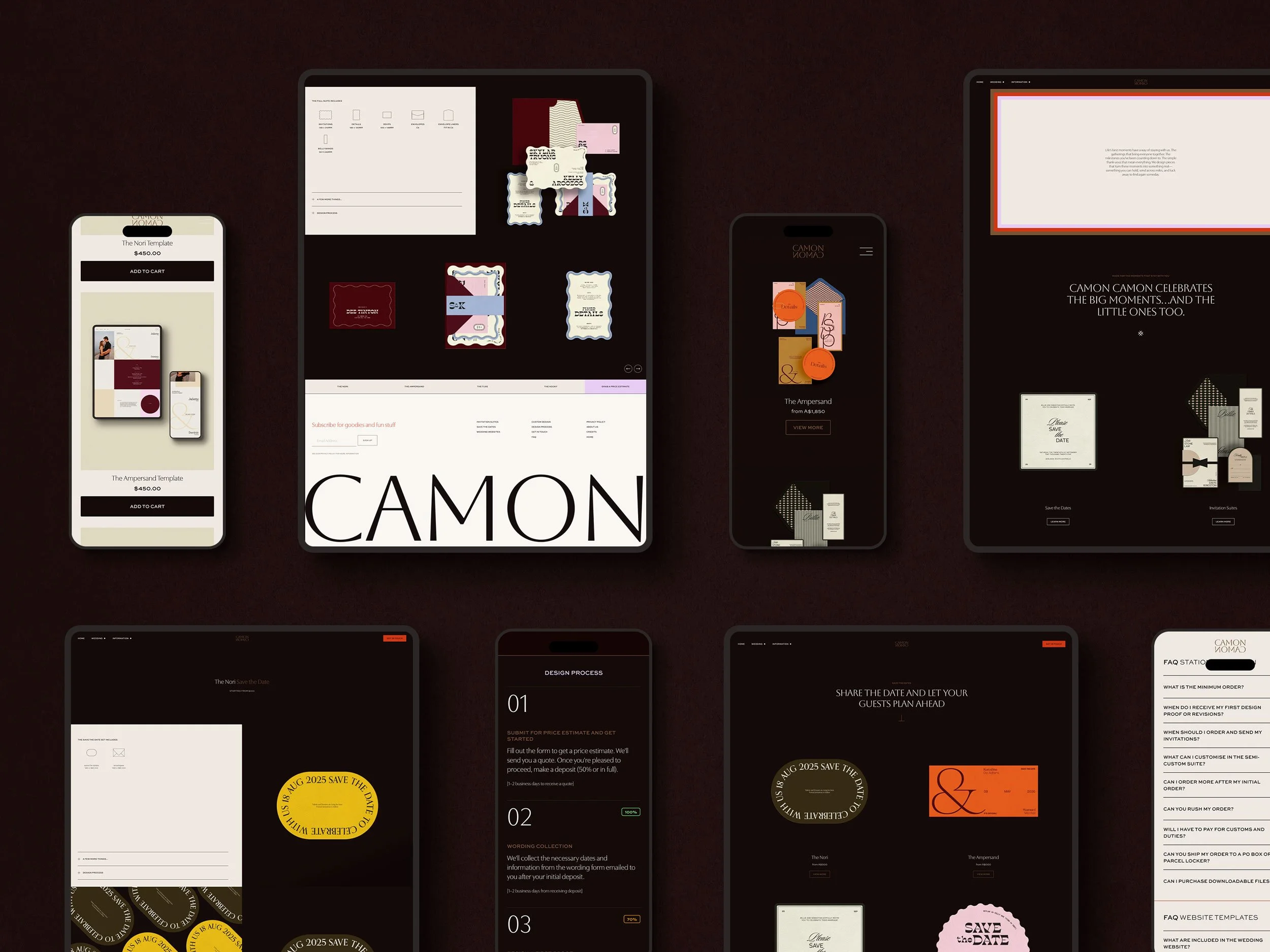
Website
The Semi-custom Suites
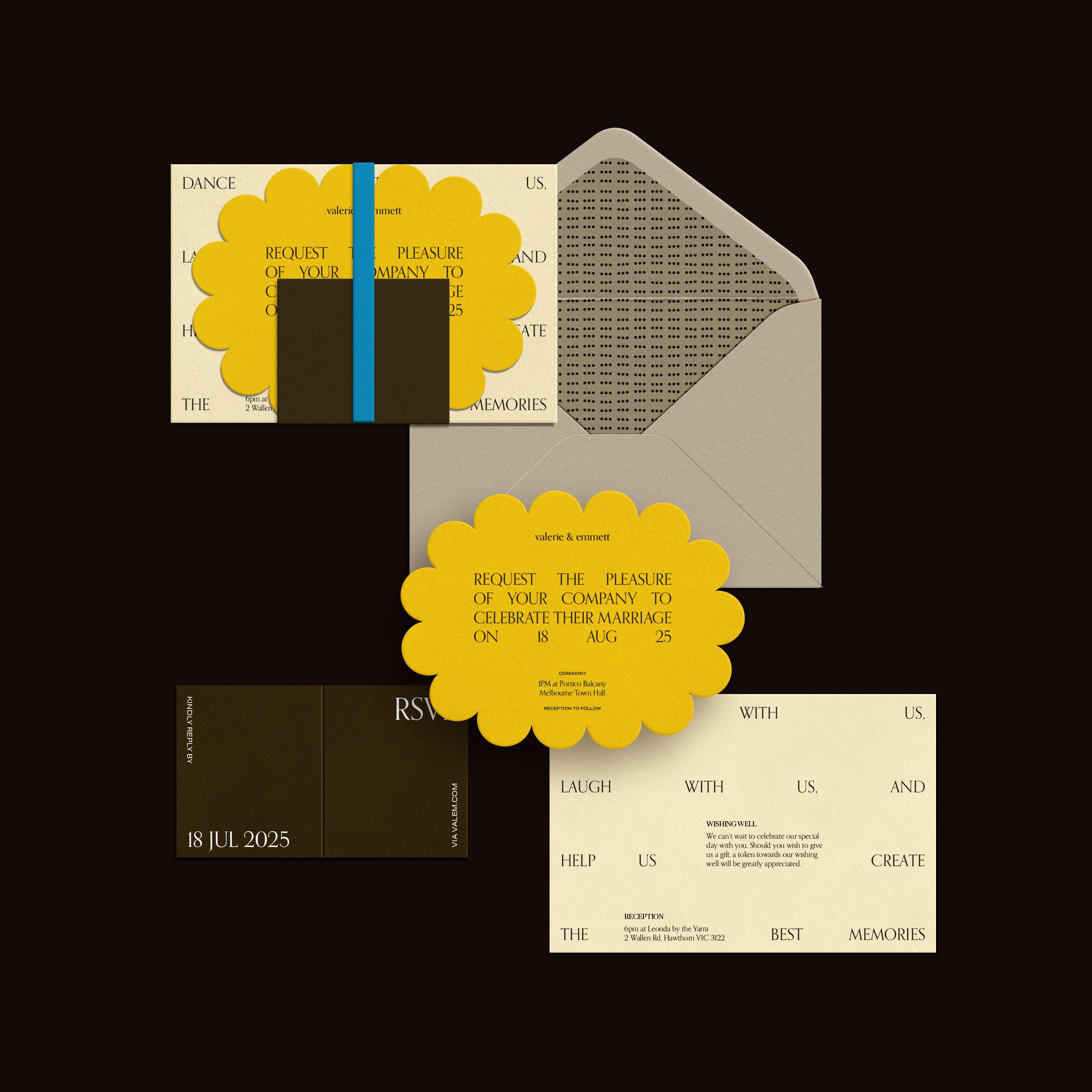
THE NORI
Bold, playful and nostalgic, with bright colour and layered print details.

THE AMPERSAND
Graphic and expressive, built around typographic shapes and warm contrast.
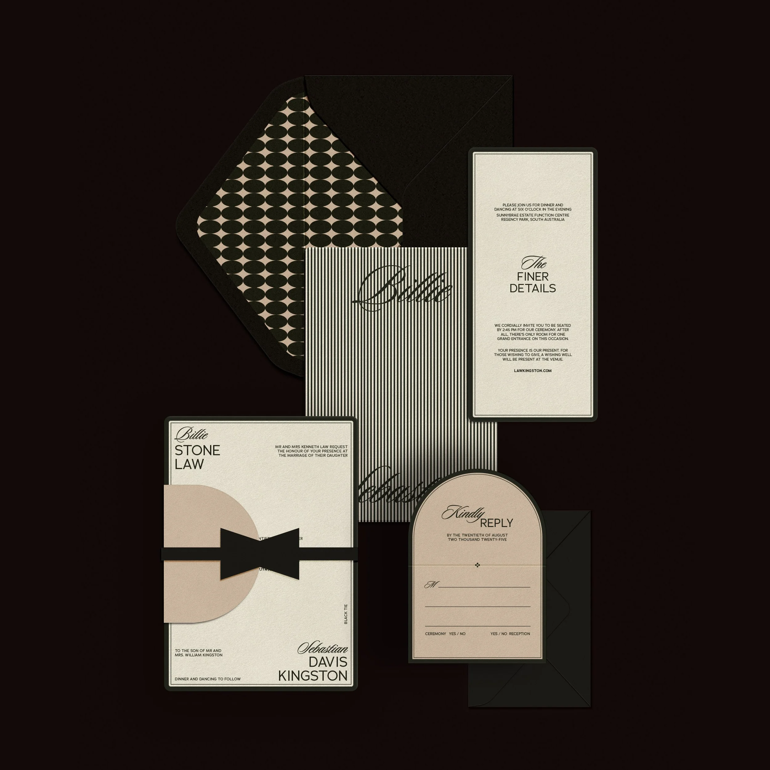
THE TUXE
Refined and architectural, with monochrome details and a formal edge.
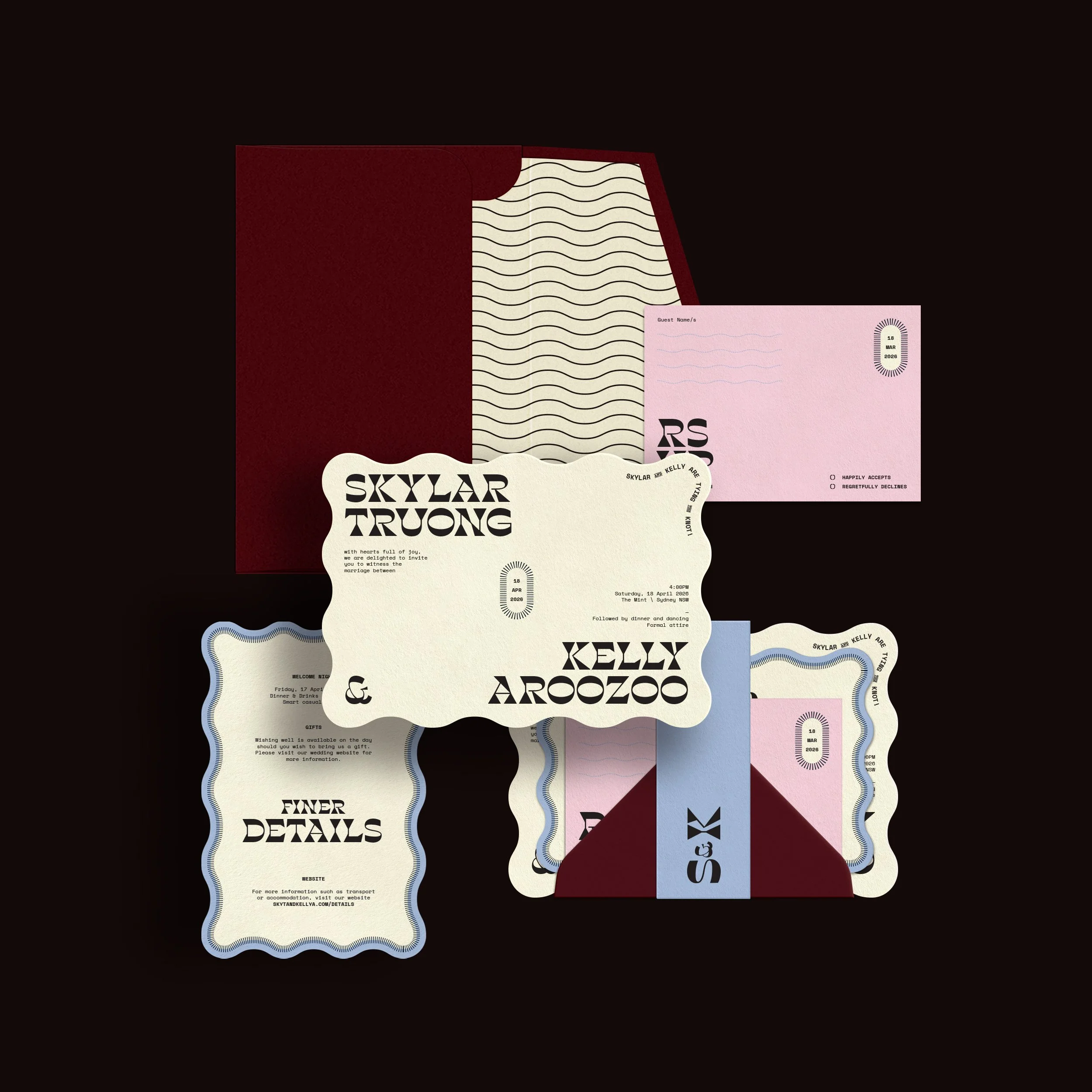
THE KOOKY
Playful, irregular and personality-led, designed for couples who want something unexpected.
KEY DESIGN DECISIONS
-
Created semi-custom designs with different personalities while keeping them connected under one brand.
-
Used typography, colour and layout details to give the stationery a tactile, keepsake quality.
-
Extended the brand from printed pieces into a website experience that supports browsing, enquiry and matching digital templates.
Wedding Website Templates