Paige Penman
Project type: One-page website concept
Industry: Copywriting, creative services, brand communication
Scope: Brand direction, visual identity, landing page concept, service structure
Platforms: Illustrator, Photoshop, Squarespace with custom CSS and HTML, and Claude for copywriting
Key skills shown: Editorial layout, typography, brand positioning, landing page strategy, service-based website structure
Before designing anything, I wanted a clear picture of who Paige would be. She's a writer in her late thirties: thoughtful, empathetic, sharp. Her confidence isn't showy; it comes through in how she works with clients and shares what she knows. Her style is simple and elegant, with a touch of eccentricity that gives away her writer's background. For her website, she wanted things minimal—one page, if possible.
BRAND FEEL
Editorial • Thoughtful • Quiet Confident
DESIGN DIRECTION
Warm neutral • Expressive Typography • White space
The Brief
Paige Penman is a self-initiated brand and one-page website concept for a copywriter working with design firms, brands and creative professionals.
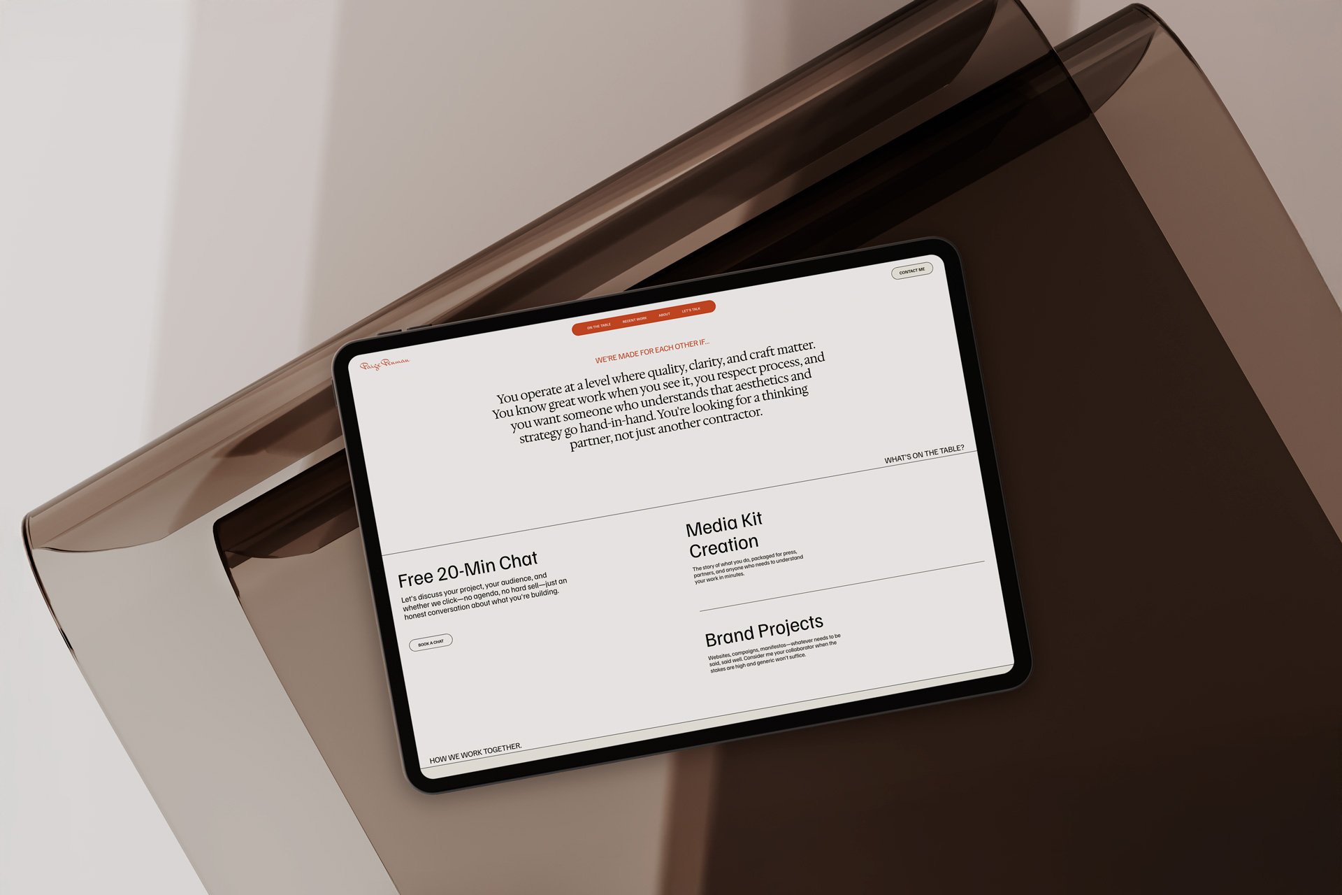
The concept was built around one main landing page strategy—introducing Paige’s positioning, showing selected proof of her writing work and guiding visitors towards enquiry without relying on a full portfolio site.
—The goal was to create a refined digital presence that feels editorial, confident and highly considered, while positioning Paige as a strategic creative partner who helps visual brands translate their identity into words.


The Execution
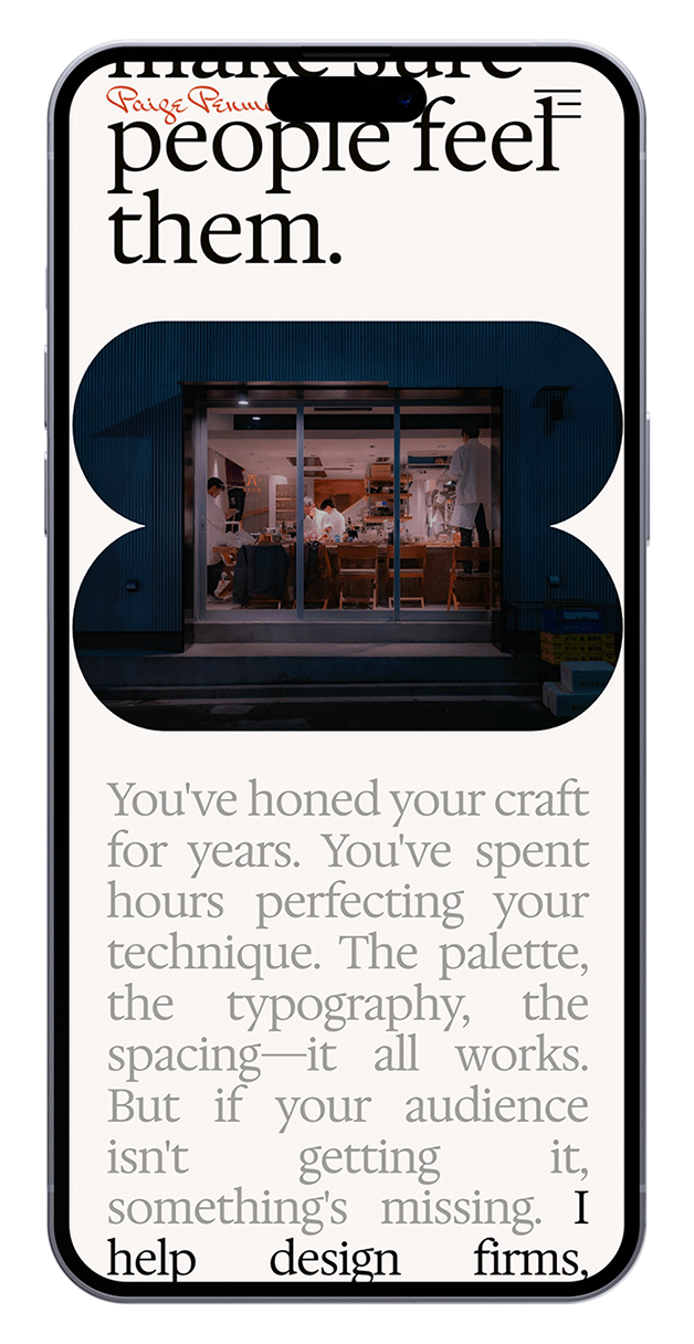
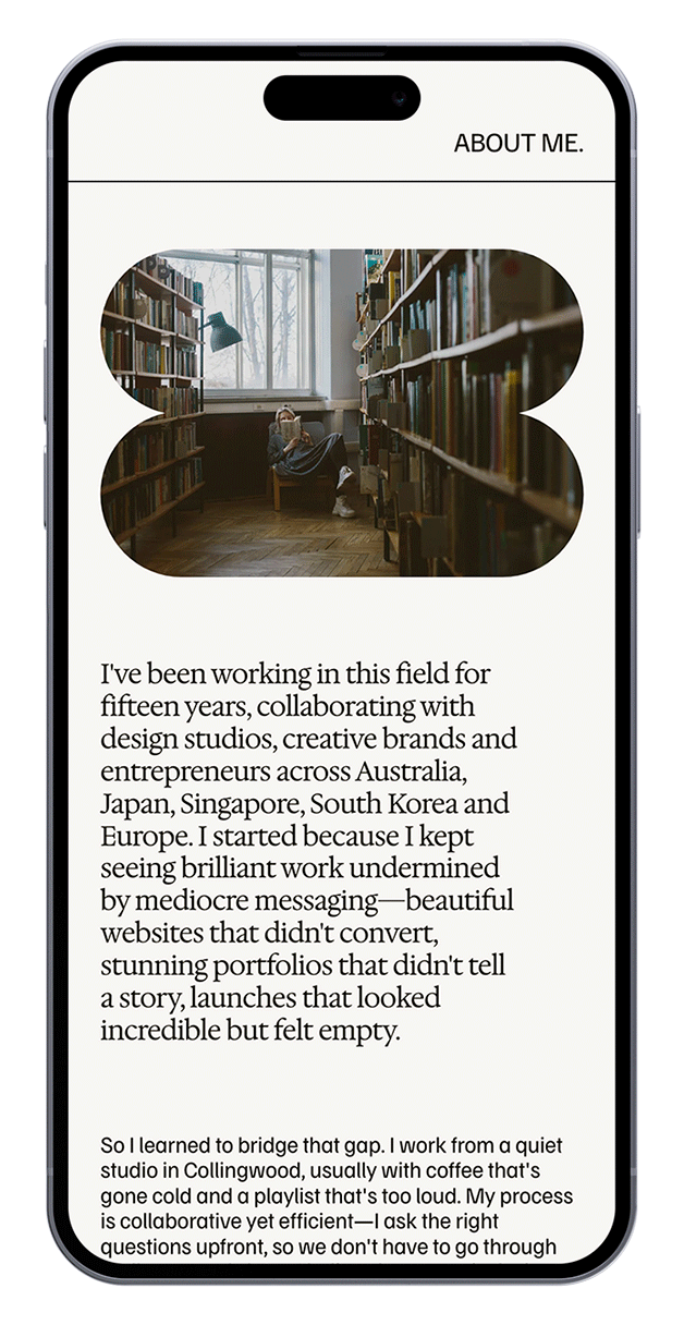
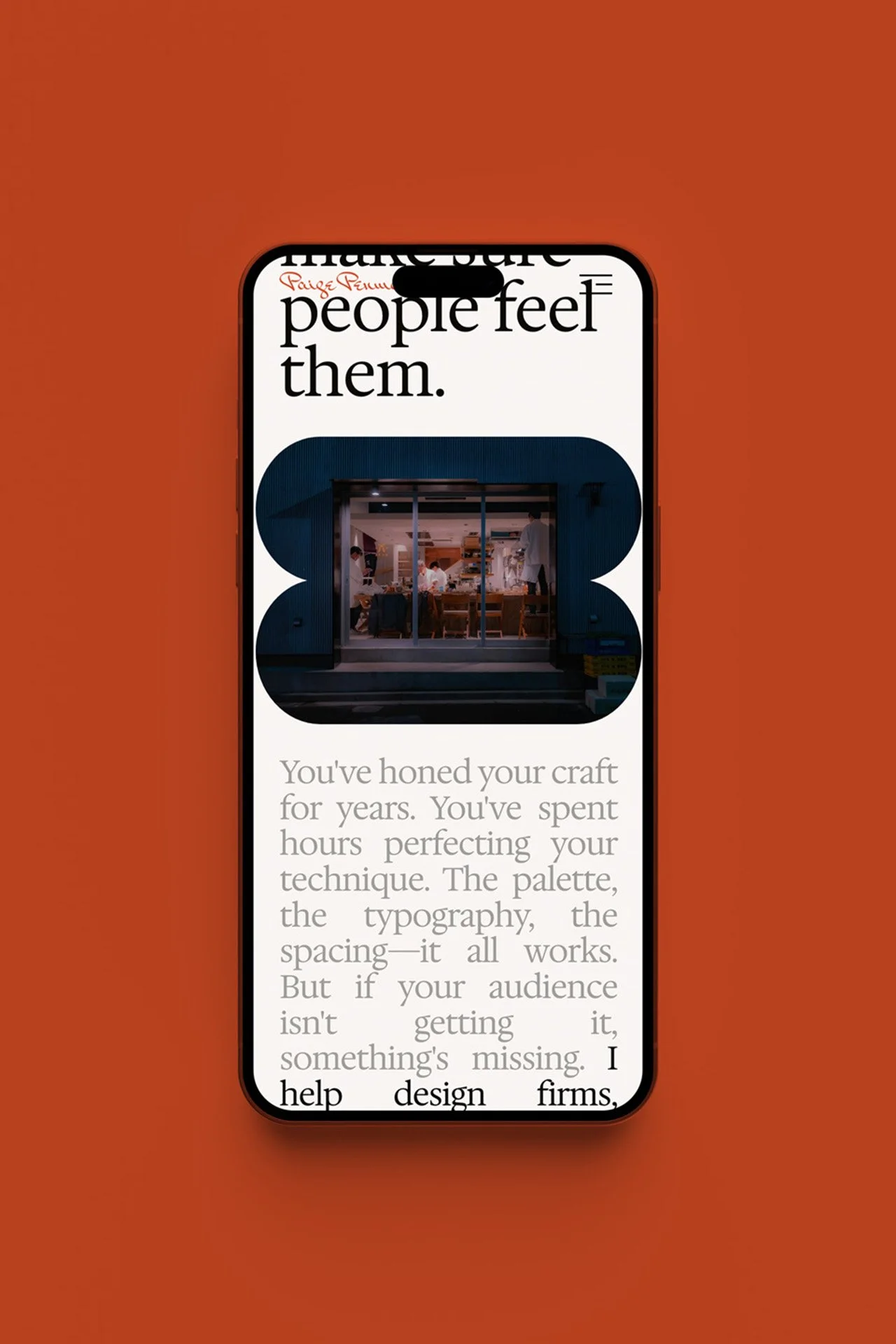
The identity and website use a restrained editorial direction, with expressive typography, warm neutral tones and a touch of subtle pink/red accents. Carefully placed image moments add depth without distracting from the written voice.
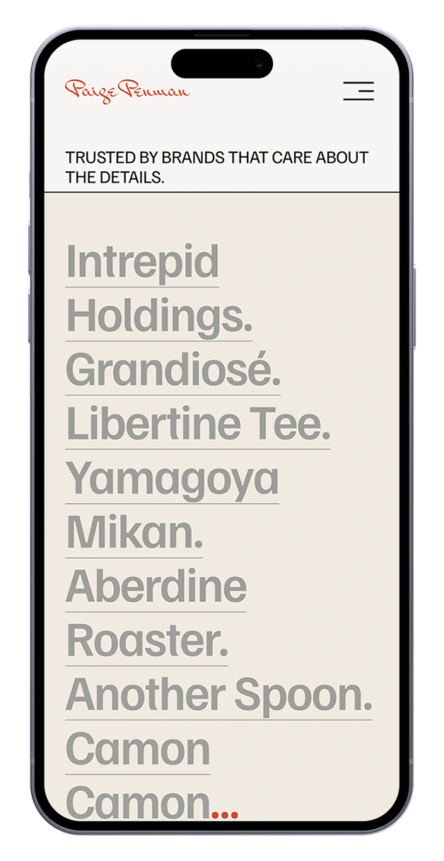
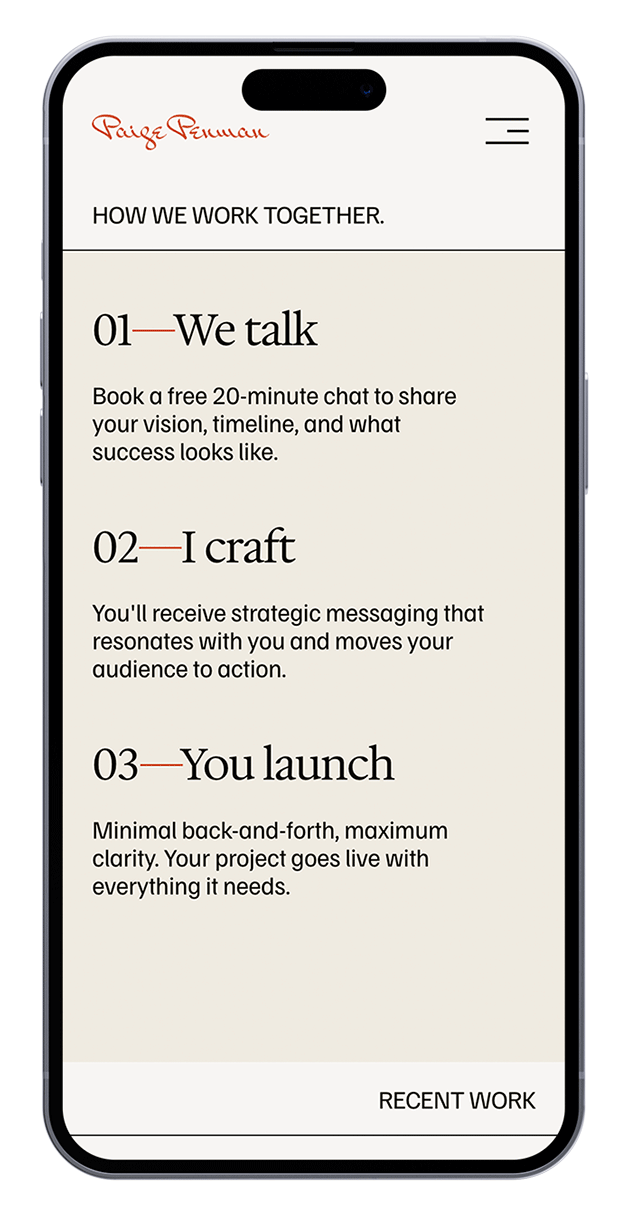
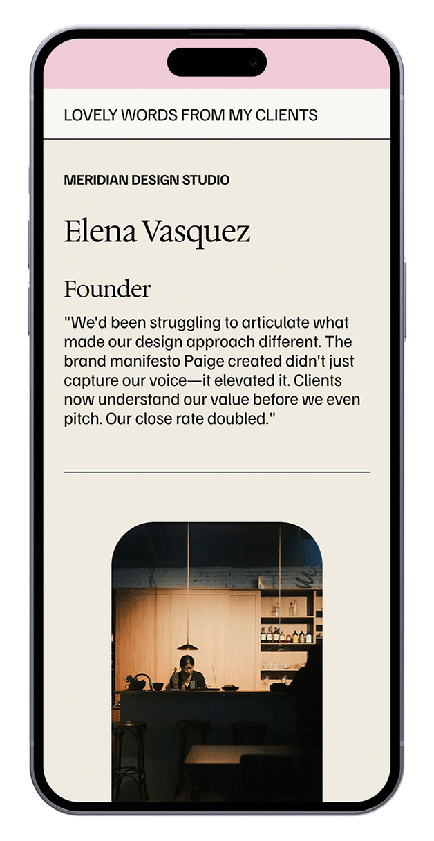
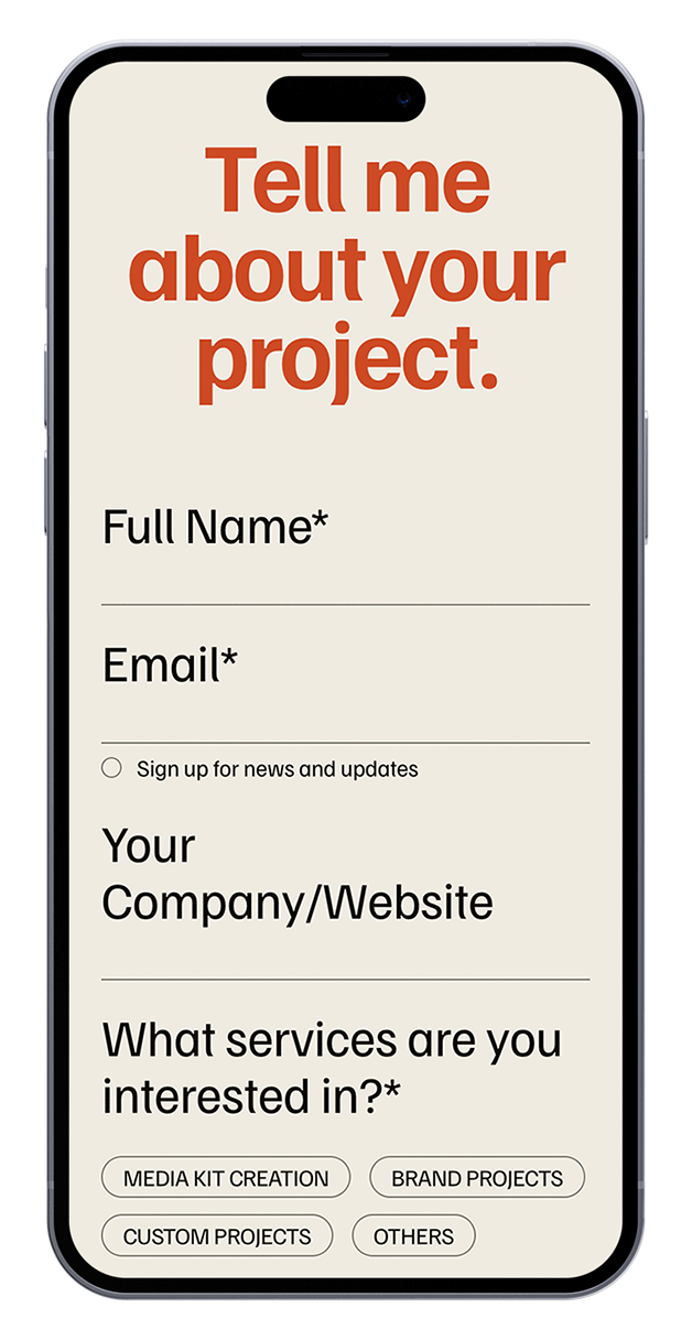
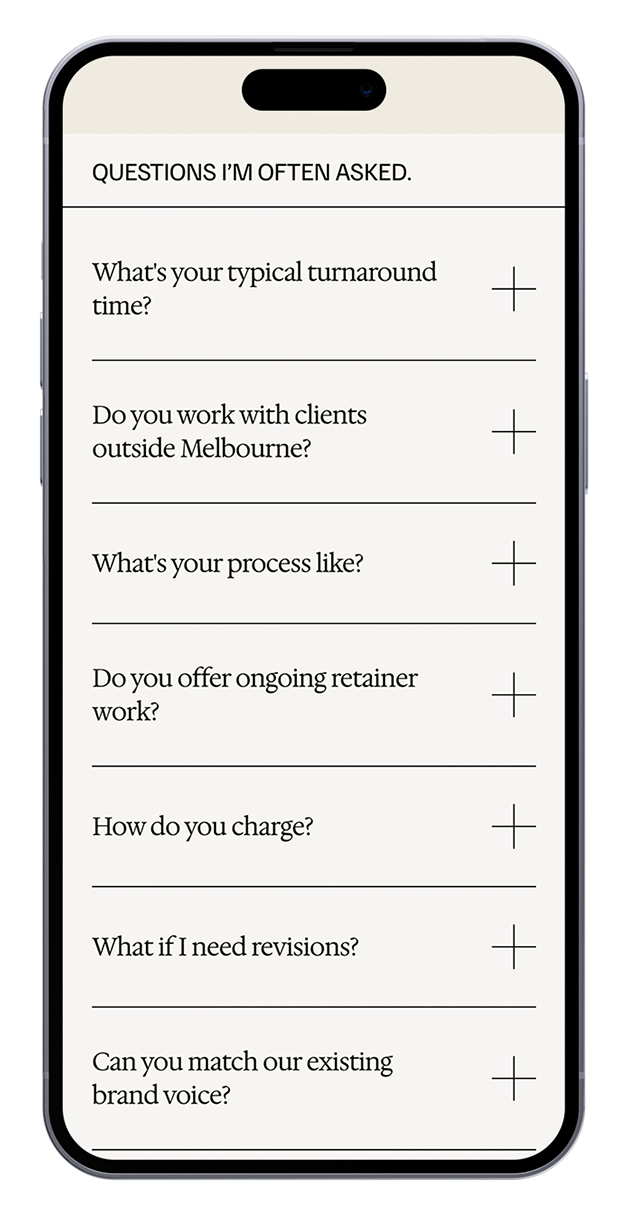
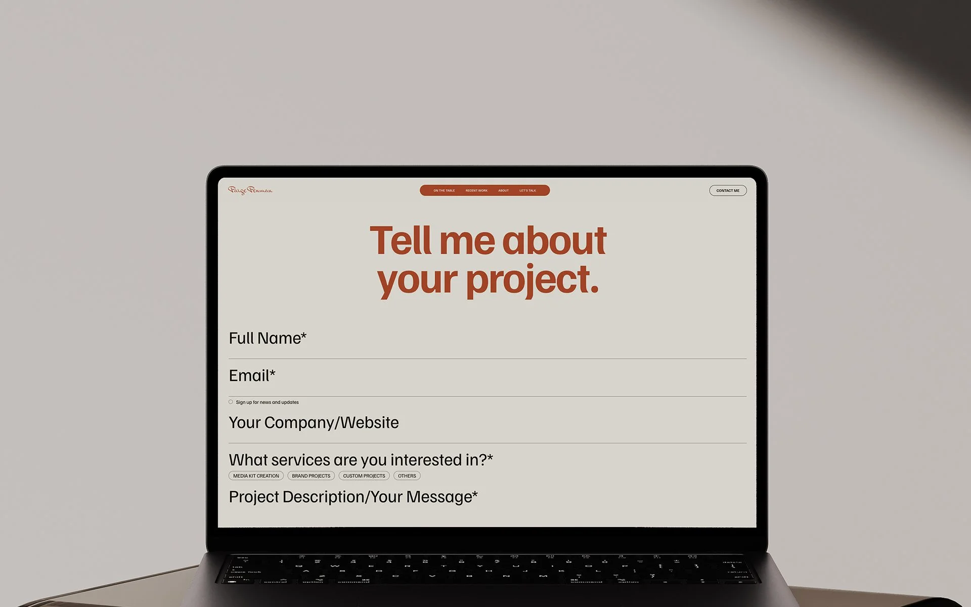
The one-page structure moves through a clear enquiry journey: strong opening statement, brand positioning, selected writing work, service offerings, process, audience fit, testimonials, contact form and FAQ. This makes the site feel complete without needing a traditional portfolio archive.
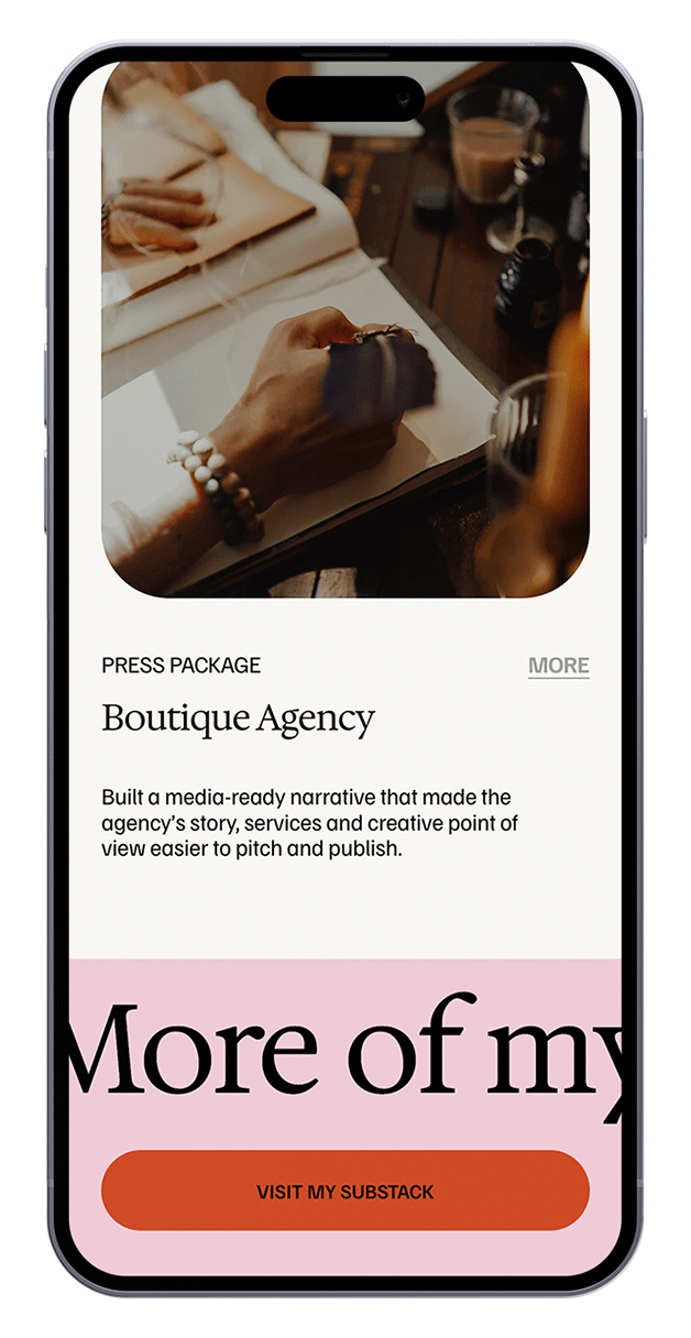
The page uses concise project-style proof points instead of long articles to show the type of copywriting work Paige offers. The case studies are then linked to the writer’s external blog platform, Substack.
-
Kept the website focused on positioning, proof and enquiry rather than a full portfolio structure.
-
Built a strong type hierarchy with expressive serif details to give the brand a thoughtful and refined quality.
-
Used soft neutral tones as the main palette, with subtle pink and red accents to add energy, personality and visual contrast.
-
Organised the page around clear offers, process steps, client fit and enquiry prompts.
KEY DESIGN DECISIONS